Create, manage, and collect responses using interactive forms directly inside WhatsApp.
Overview
WhatsApp Interactive Forms allow you to create multi-screen forms that users can fill out directly within WhatsApp. These forms support text inputs, date selection, dropdowns, multiple-choice options, and file uploads-all within a chat interface.
You can use these forms to collect information, automate workflows, and improve user interactions without redirecting users outside WhatsApp.
Step 1: Login to Your Chatflow Account
Access your Pabbly Chatflow account using your credentials.
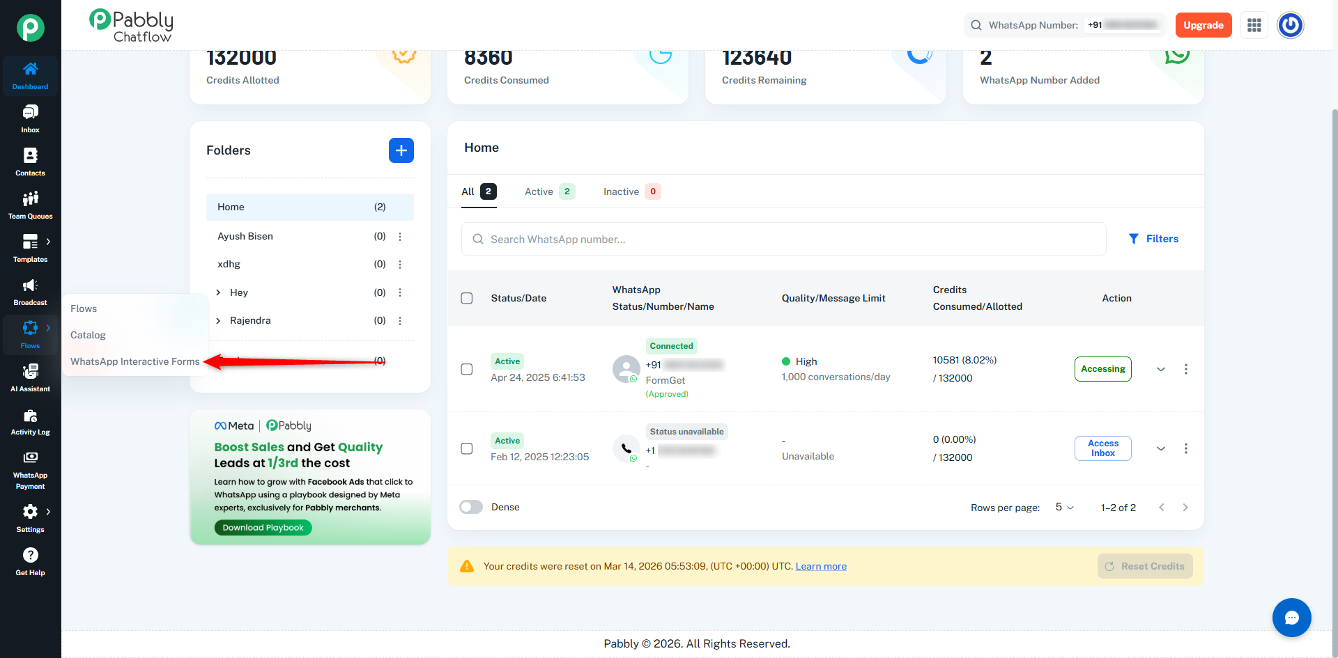
On the left sidebar:
- Click on the Flows section
- Select WhatsApp Interactive Forms
You will see a list of all your forms.
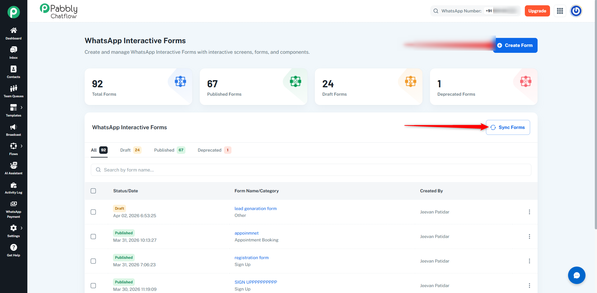
You can also sync forms created on Meta to make them available in Pabbly Chatflow.
- Click on the Sync Forms button
- This will fetch forms that were created on Meta and add them to your forms list
👉 Note:
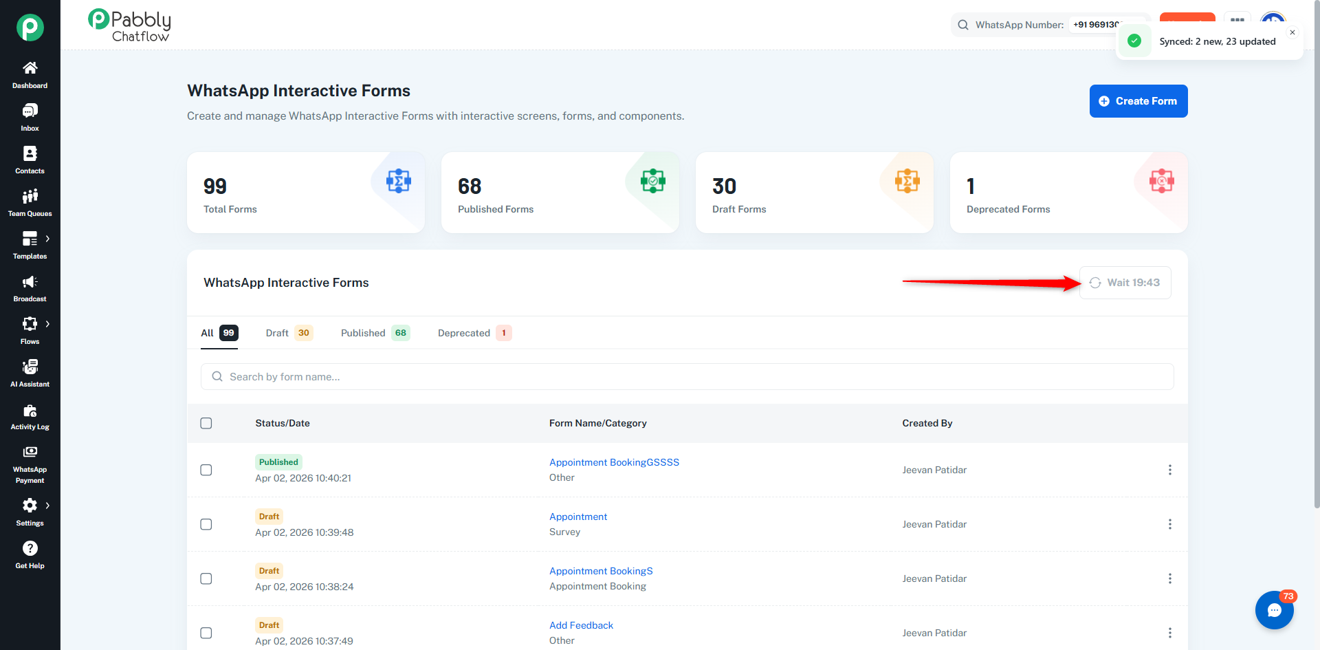
- Sync may take up to 20 minutes
- There is a cooldown between sync attempts
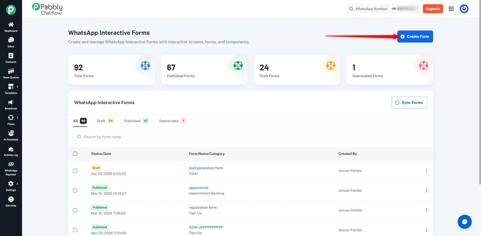
- Click on the Create Form button
- Enter the required details
Enter a name for your form (for internal identification).
Select Category
Choose a category based on your use case:
- Sign Up
- Sign In
- Appointment Booking
- Lead Generation
- Contact Us
- Customer Support
- Survey
- Other
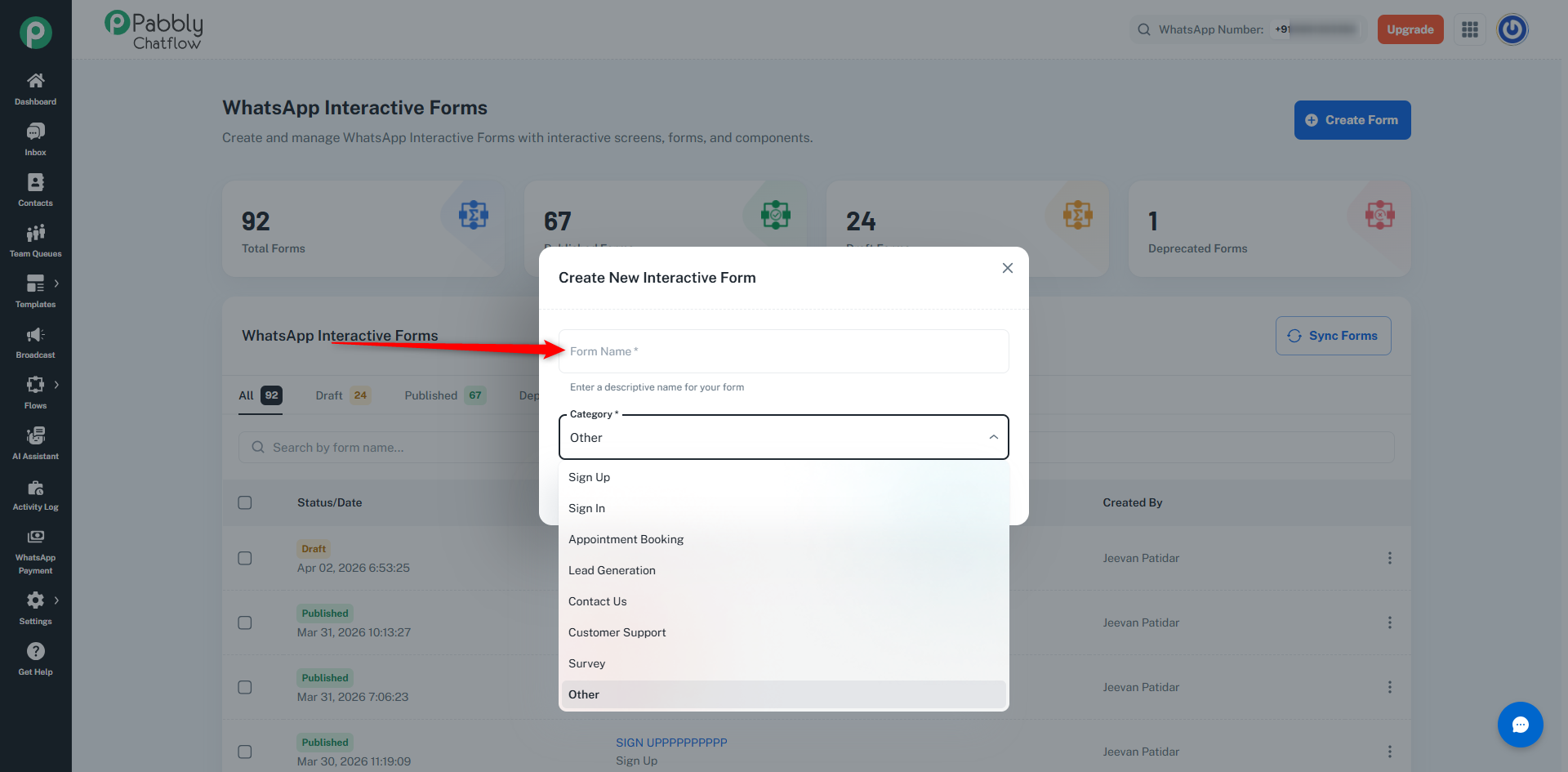
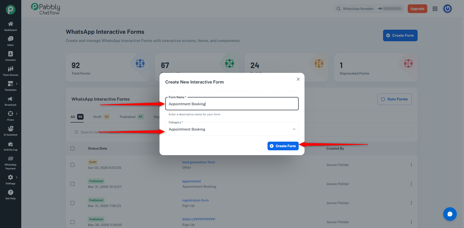
Once the form is created, you will enter the Form Builder.
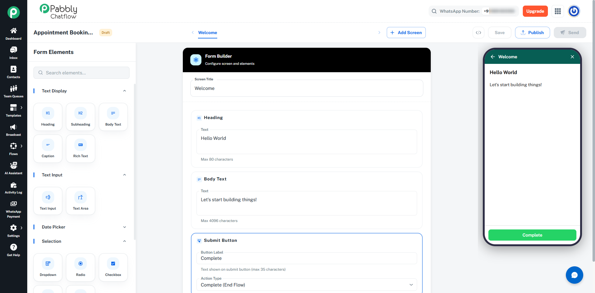
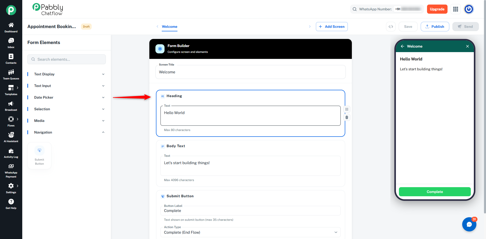
The Form Builder is divided into three sections:
Left Panel – Element Palette
- Browse available elements
- Search elements
- Click to add elements
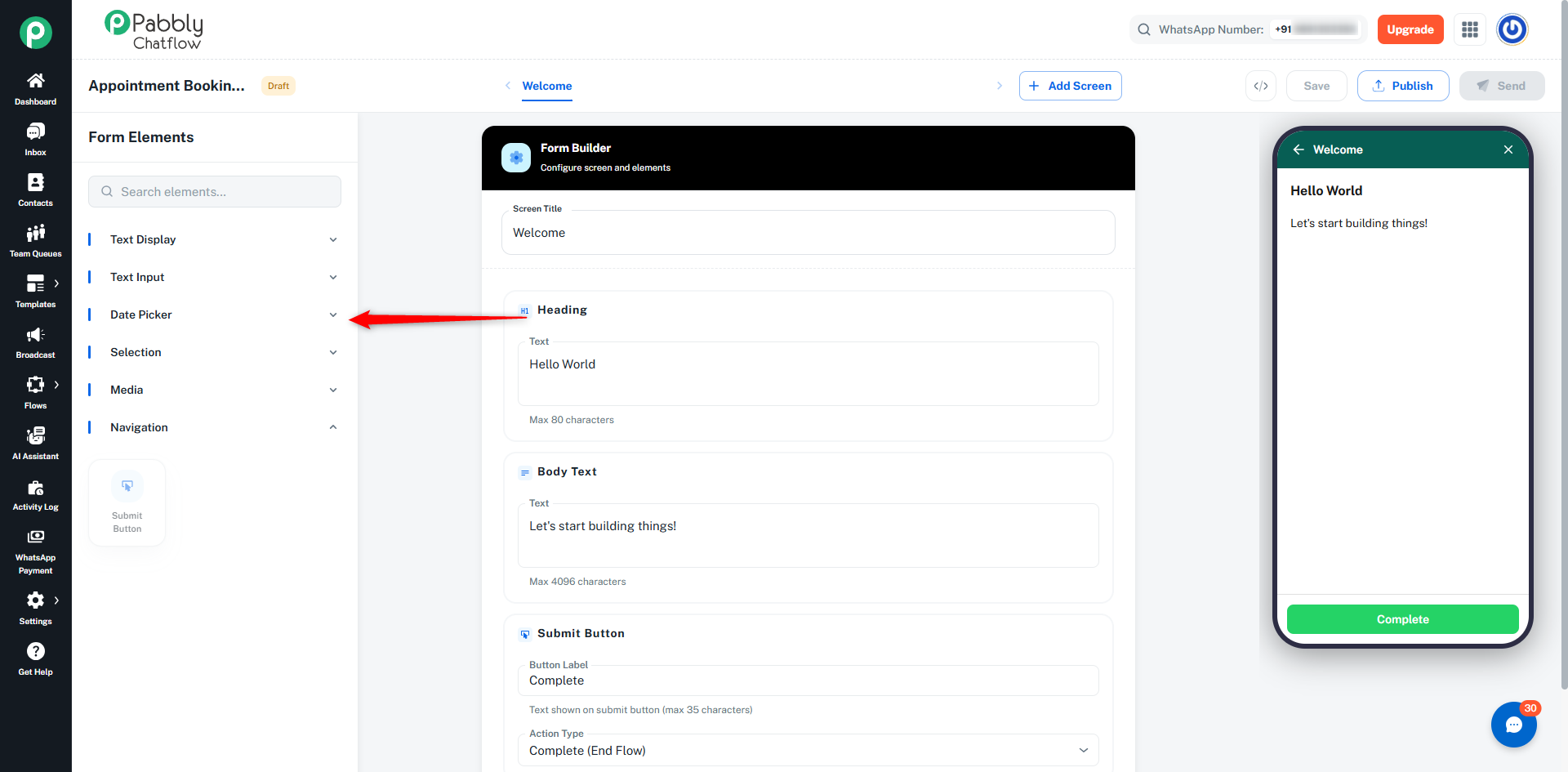
- Categories include:
- Text Display
- Text Input
- Date Picker
- Selection
- Media
- Navigation
- Edit screen title
- View added elements
- Configure field settings
- Drag to reorder elements
- Delete elements
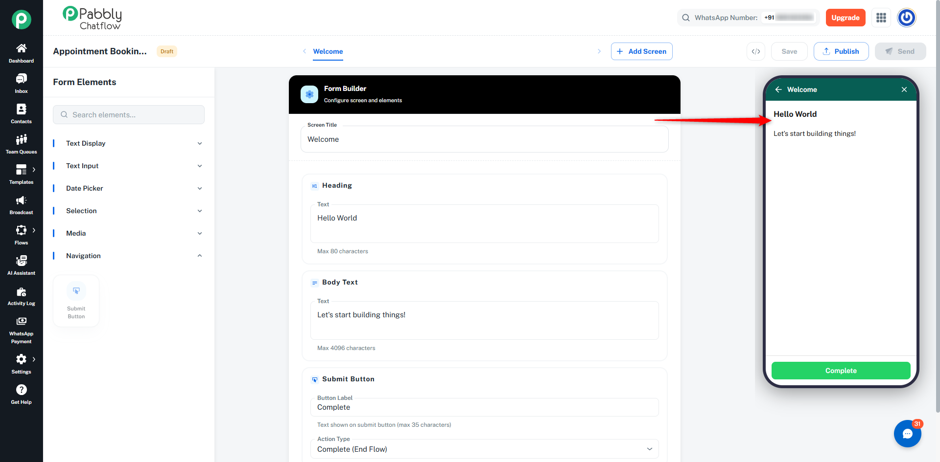
Right Panel – Live Preview
- Real-time preview
- Shows exactly how users will see the form
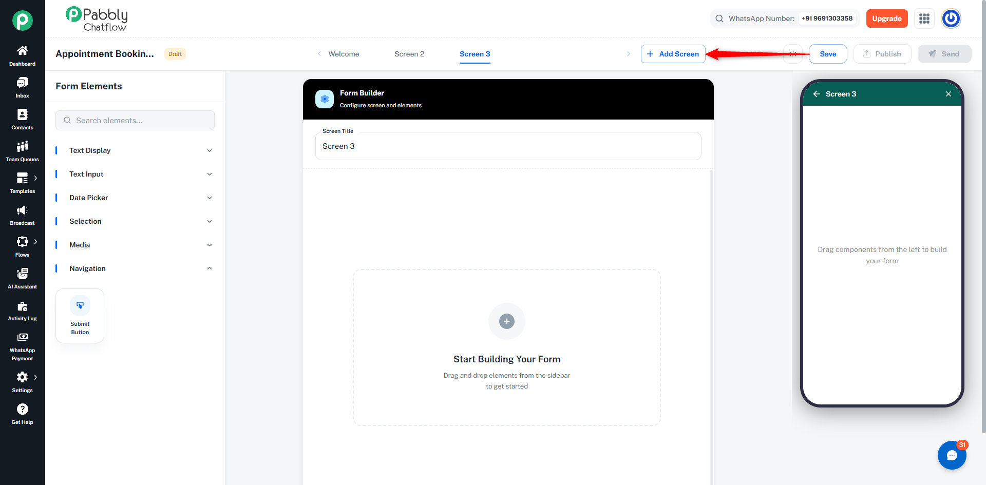
Screen Tabs
- Add multiple screens
- Switch between screens
- Configure each screen independently
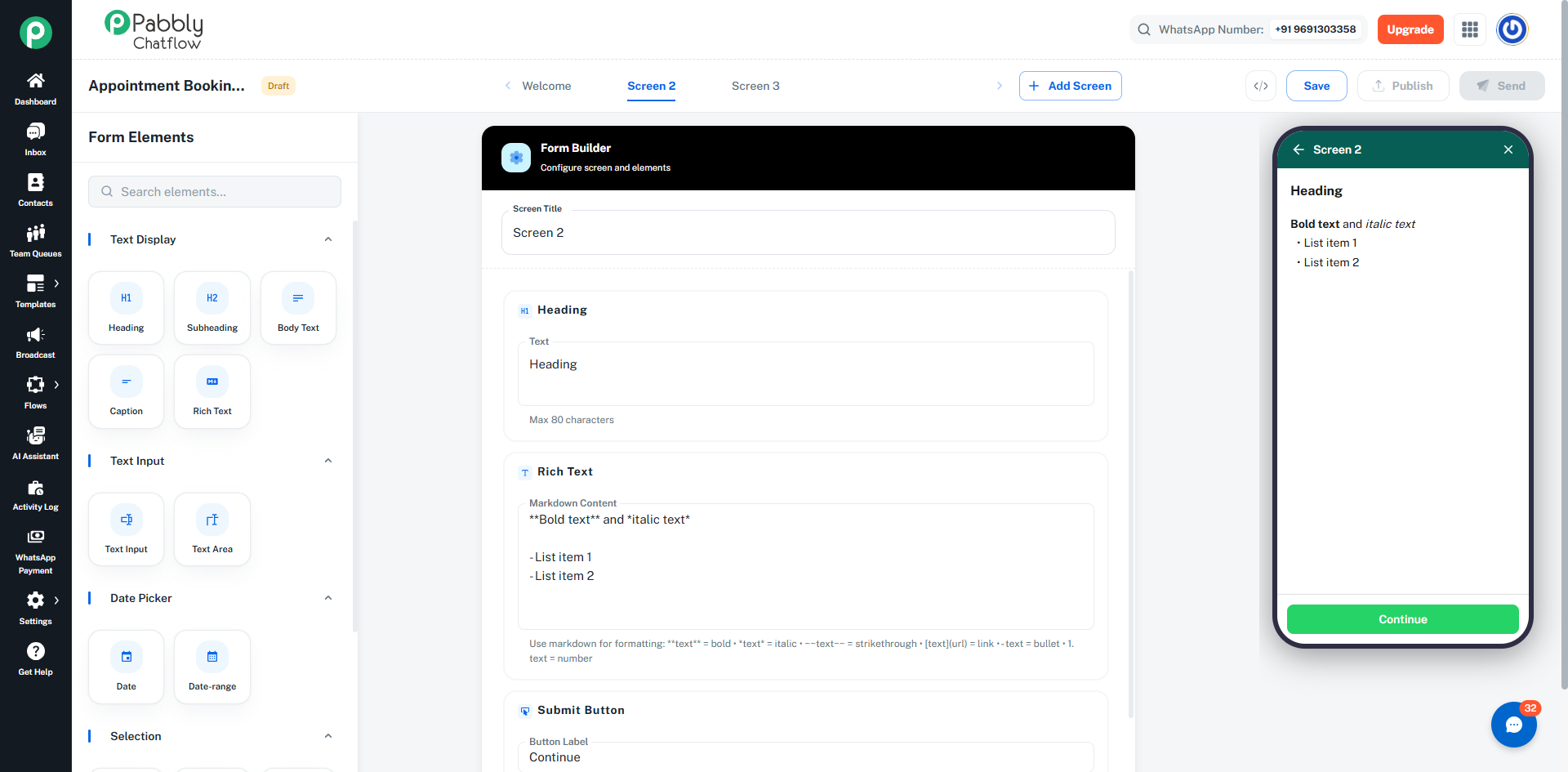
Step 8: Adding Elements
How to Add
- Select an element from the left panel
- Add it to the screen
- Configure its properties
Element Rules
- Only 1 submit button per screen
- Only 1 upload element (photo or document) per screen
- Maximum 50 elements per screen
- Maximum 5 consent (opt-in) elements per screen
Reordering Elements
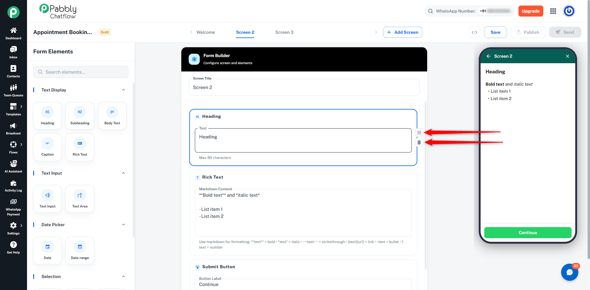
- Use arrow buttons to move elements
- Submit button always stays at the bottom
Deleting Elements
- Click the delete icon
- Submit button auto-recreates if needed
Element Types
You can add different types of elements to your form based on the information you want to collect or display.
📝 Text Display Elements
These elements are used to show information to users.
Heading
- Displays large title text
- Best used for screen titles or section headers
- Maximum 80 characters
Subheading
- Displays smaller heading text
- Used for section titles
- Maximum 80 characters
Body Text
- Displays descriptive text or instructions
- Useful for guiding users
- Maximum 4,096 characters
Caption
- Displays small supporting text
- Used for notes or additional information
- Maximum 4,096 characters
Rich Text
- Displays formatted text
- Supports:
- Bold
- Italic
- Strikethrough
- Links
- Bullet points
- Numbered lists
- Maximum 4,096 characters
🧾 Text Input Elements
Used to collect text-based input from users.
Text Input
- Single-line input field
- Used for:
- Options:
- Required field
- Character limits
- Helper text
Text Area
- Multi-line input field
- Used for longer responses like:
- Feedback
- Notes
- Descriptions
- Supports character limits and helper text
📅 Date Elements
Used to collect date-related information.
Date Picker
- Allows users to select a single date
- Can restrict date range
- Useful for:
- Appointment dates
- Booking dates
Date Range
- Allows users to select start and end dates
- Useful for:
- Travel duration
- Event duration
🔘 Selection Elements
Used when users need to choose from options.
Dropdown
- Displays a list of options
- User selects one option
- Best for long lists
Radio Buttons
- Shows all options
- User selects one option
- Best for short lists
Checkbox
- Allows multiple selections
- Users can choose more than one option
Chips
- Multi-select option in compact UI
- Similar to checkbox but visually different
Opt-In
- Single checkbox
- Used for:
Used for displaying or collecting files.
Image
- Displays an image inside the form
- Used for:
Photo Upload
- Users can upload images
- From camera or gallery
Document Upload
- Users can upload files
- Example:
👉 Note: Only one upload element (photo or document) is allowed per screen.
🔘 Navigation Element
Submit Button (Footer)
- Appears at the bottom of each screen
- Used to:
- Move to next screen (Next)
- Submit the form (Submit)
👉 Important:
- Each screen must have exactly one button
- Final screen must use Submit
Adding Screens
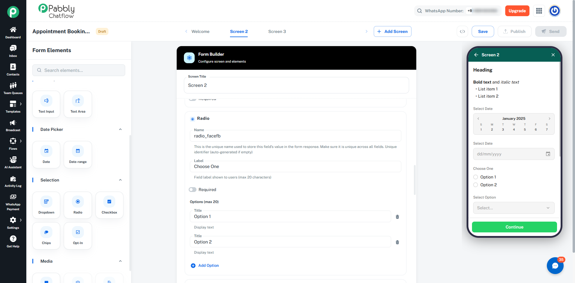
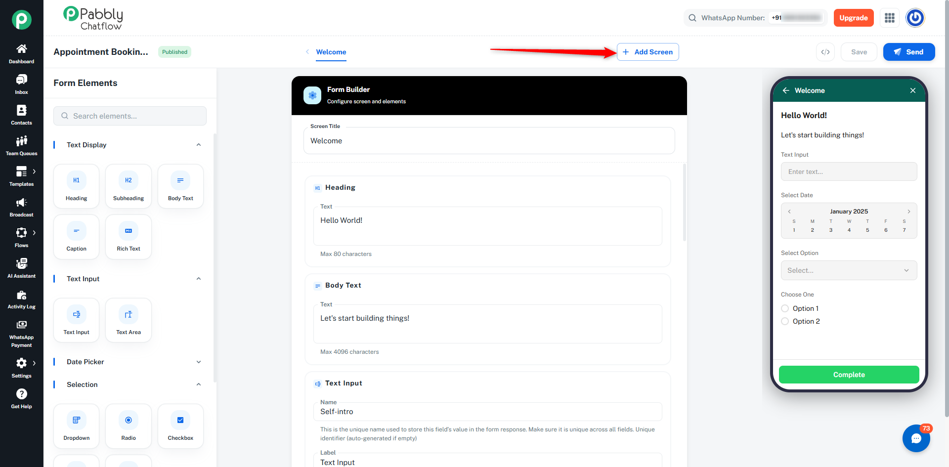
- Click Add Screen
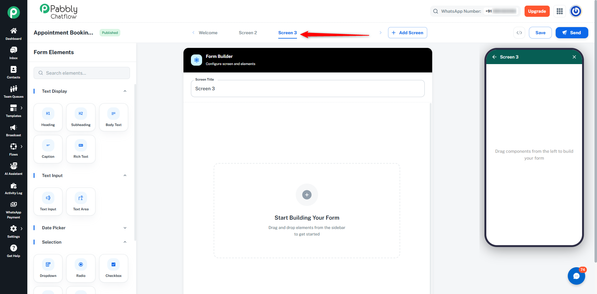
- Each screen can have its own title
Navigation
- Use button actions:
- Next → Move to next screen
- Submit → Complete form
Screen 1 → User Info
Screen 2 → Details
Screen 3 → Upload & Confirm
- Click Save
- Ensures your form is stored properly
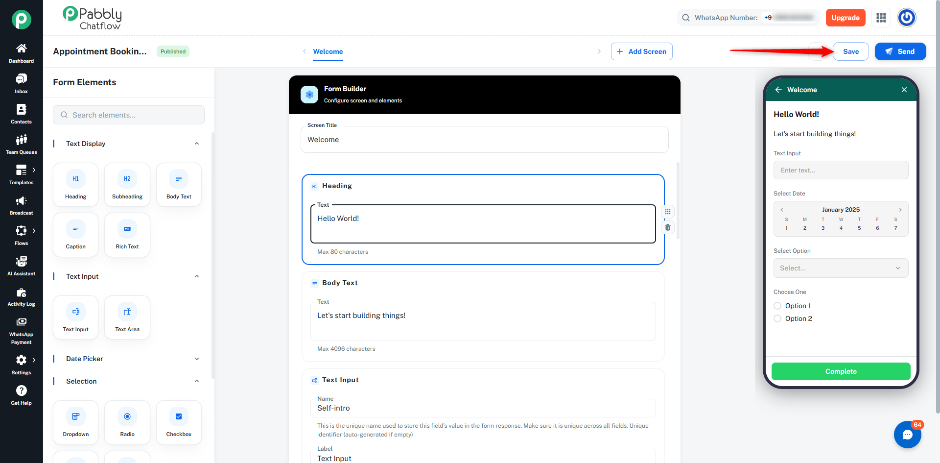
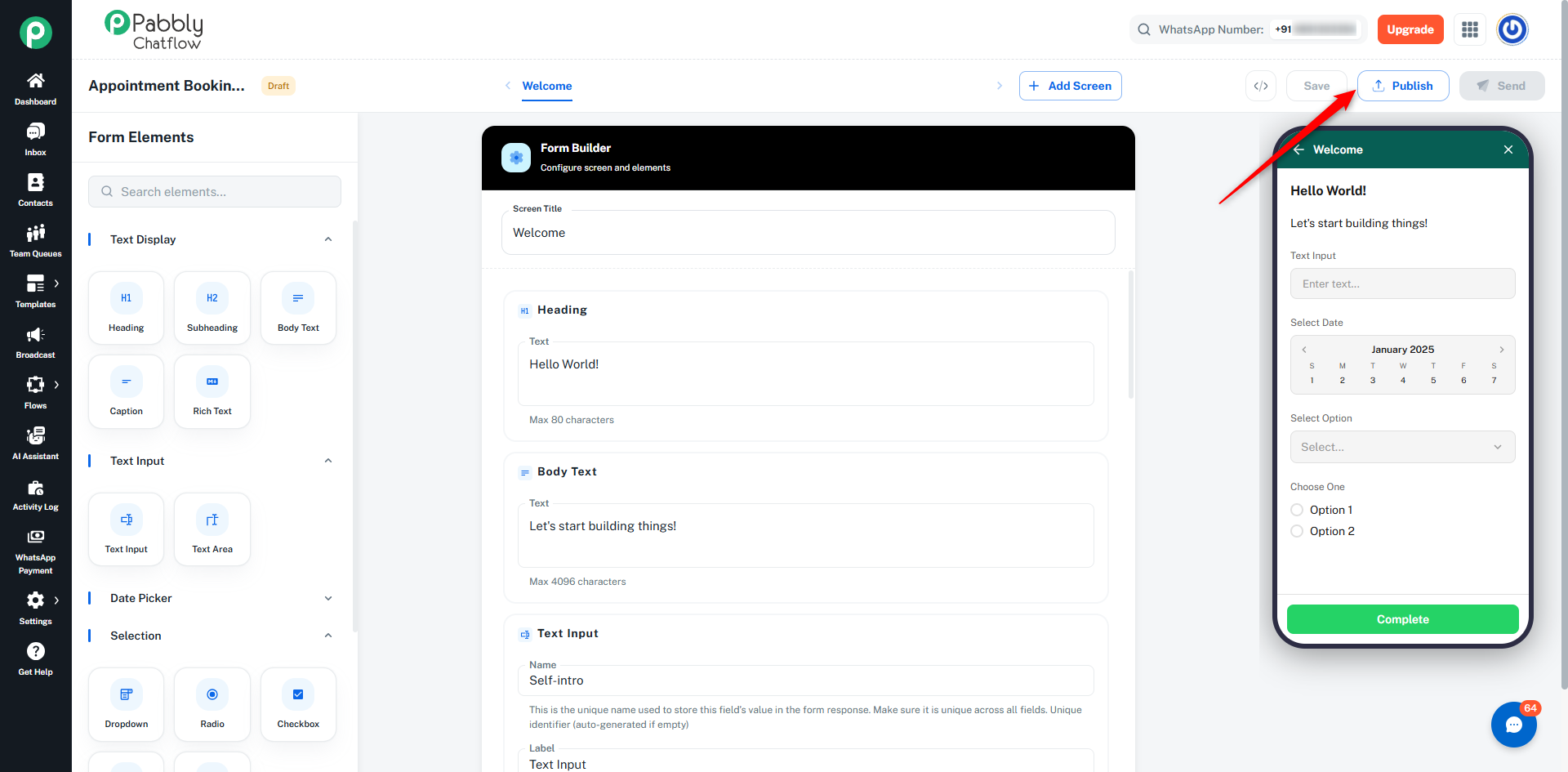
- Click Publish
- Makes the form live
👉 Only published forms can be sent
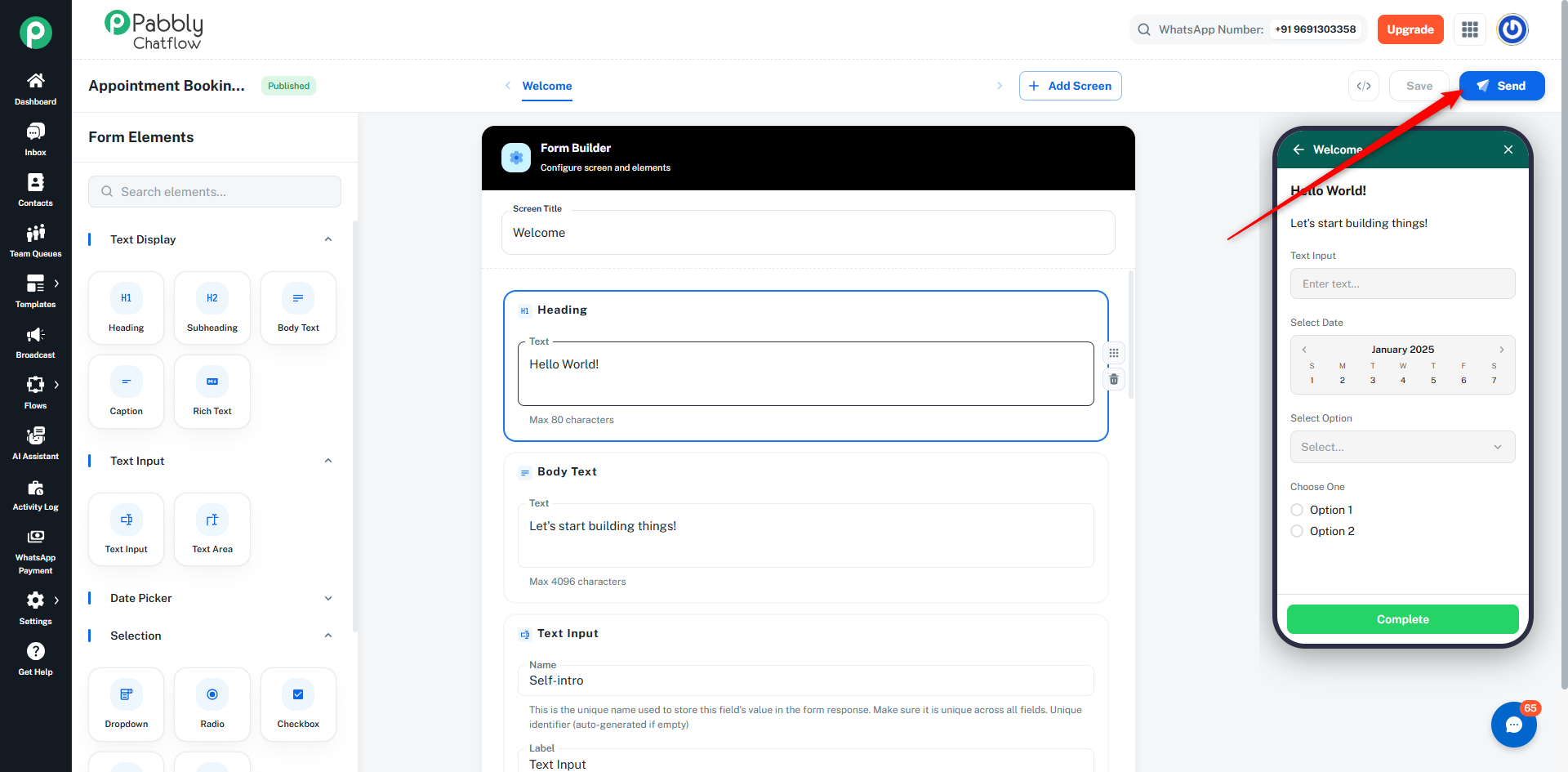
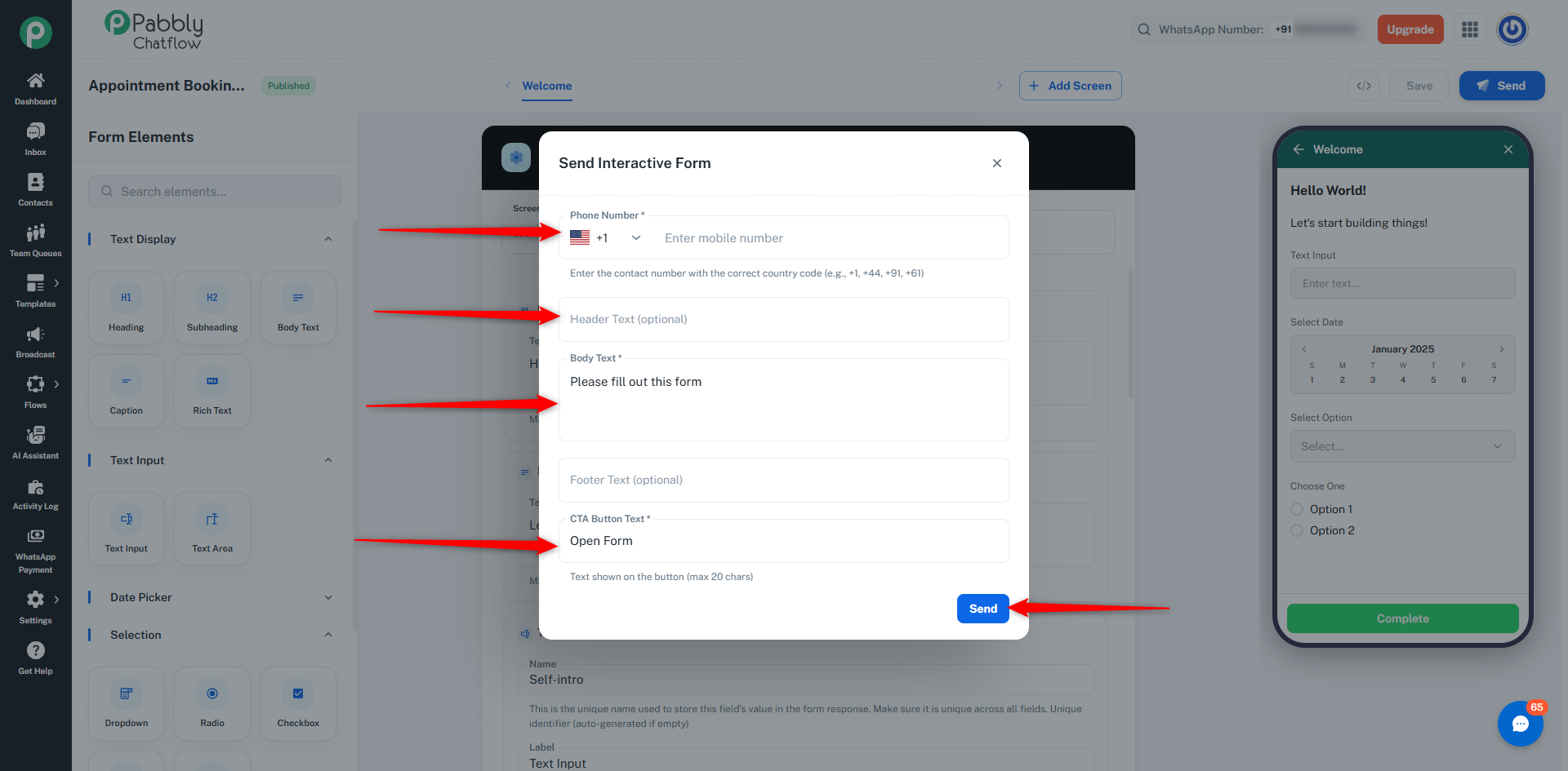
- Click Send
- Enter:
- Phone number
- Message text
- Button text
- Click Send
👉 Important Note:
WhatsApp Forms are sent as a message. If the user is outside the 24-hour messaging window, the WhatsApp Form message will not be delivered.
Step 13: User Experience
- User receives message
- Clicks button
- Form opens in WhatsApp
- Fills details
- Submits
Step 14: View Responses
- Responses are displayed directly in the Inbox chat
- Data shown in structured format
- Full details available on preview
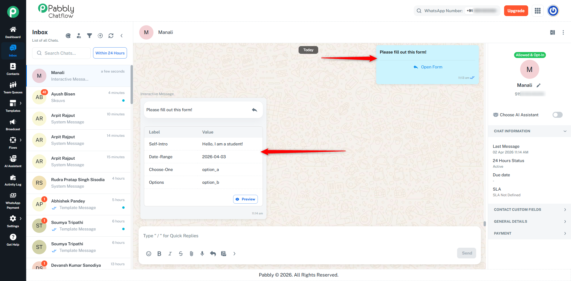
By default, a submit/navigation button is automatically added to each screen when you add elements. This button allows users to move to the next screen if multiple screens are added or submit the form on the final screen.
Step 15: Use JSON Editor
You can also create or edit your form using JSON.
- Click on the JSON (</>) button in the top right corner
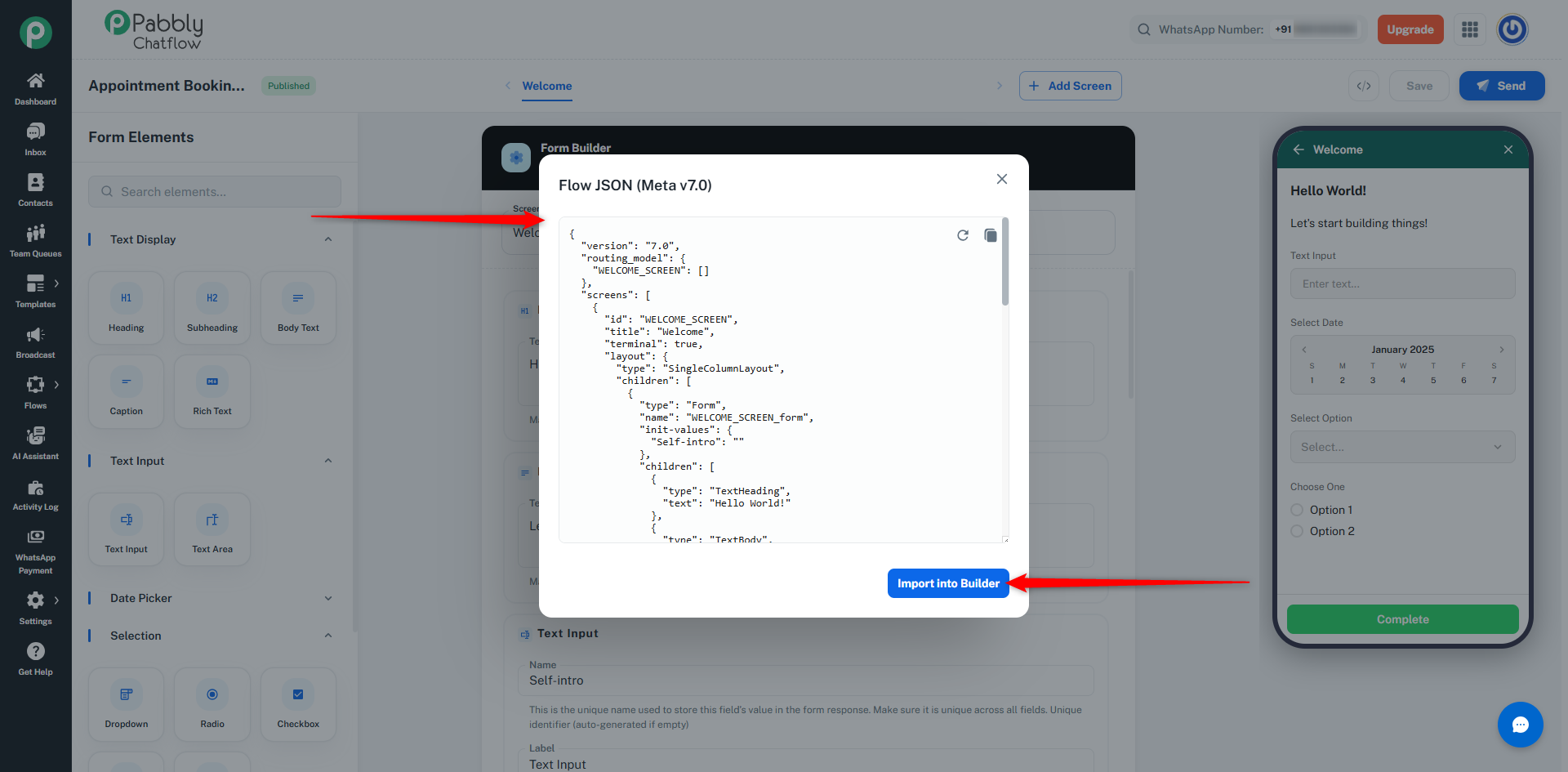
- A JSON editor will open
You can:
- View the form structure
- Edit the JSON manually
- Paste your own JSON
- Import it directly into the builder
- Click Import into Builder to apply the JSON to your form
👉 Note:
- You can either edit the existing JSON or paste your own JSON
- Changes will reflect in the form builder after importing
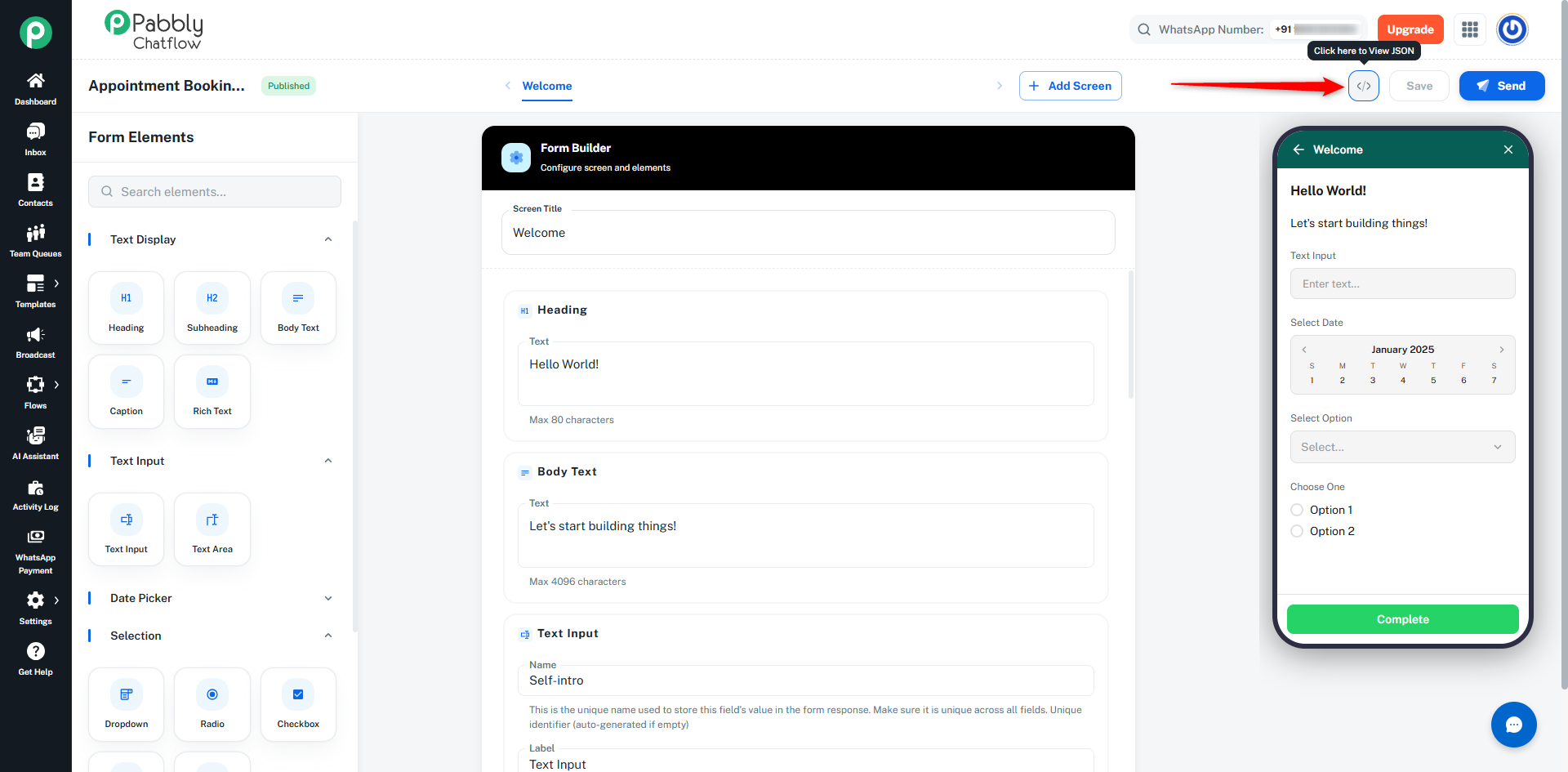
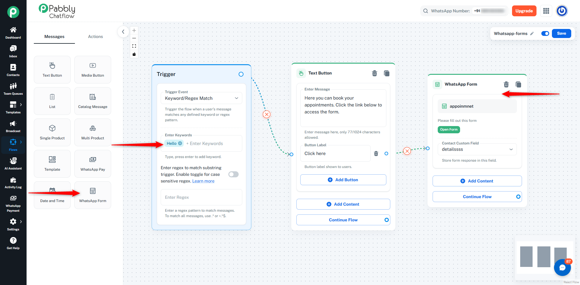
You can also use WhatsApp Interactive Forms inside automation flows using the WhatsApp Form Message.
This allows you to automatically send forms to users based on triggers instead of sending them manually.
The WhatsApp Form Message lets you send a published form to users during a chatbot conversation.
When a user reaches this step in the flow, they receive:
- A message
- A button to open the form
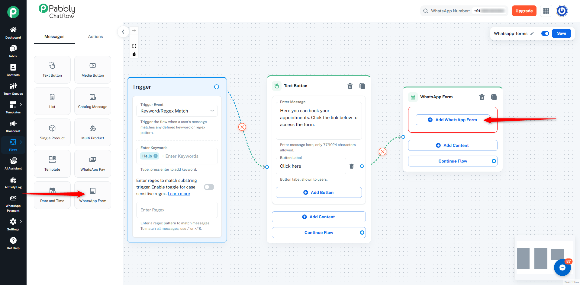
- Go to the Flow Builder
- Create or open a flow
- Drag the WhatsApp Form message onto the canvas
- Click Add WhatsApp Form
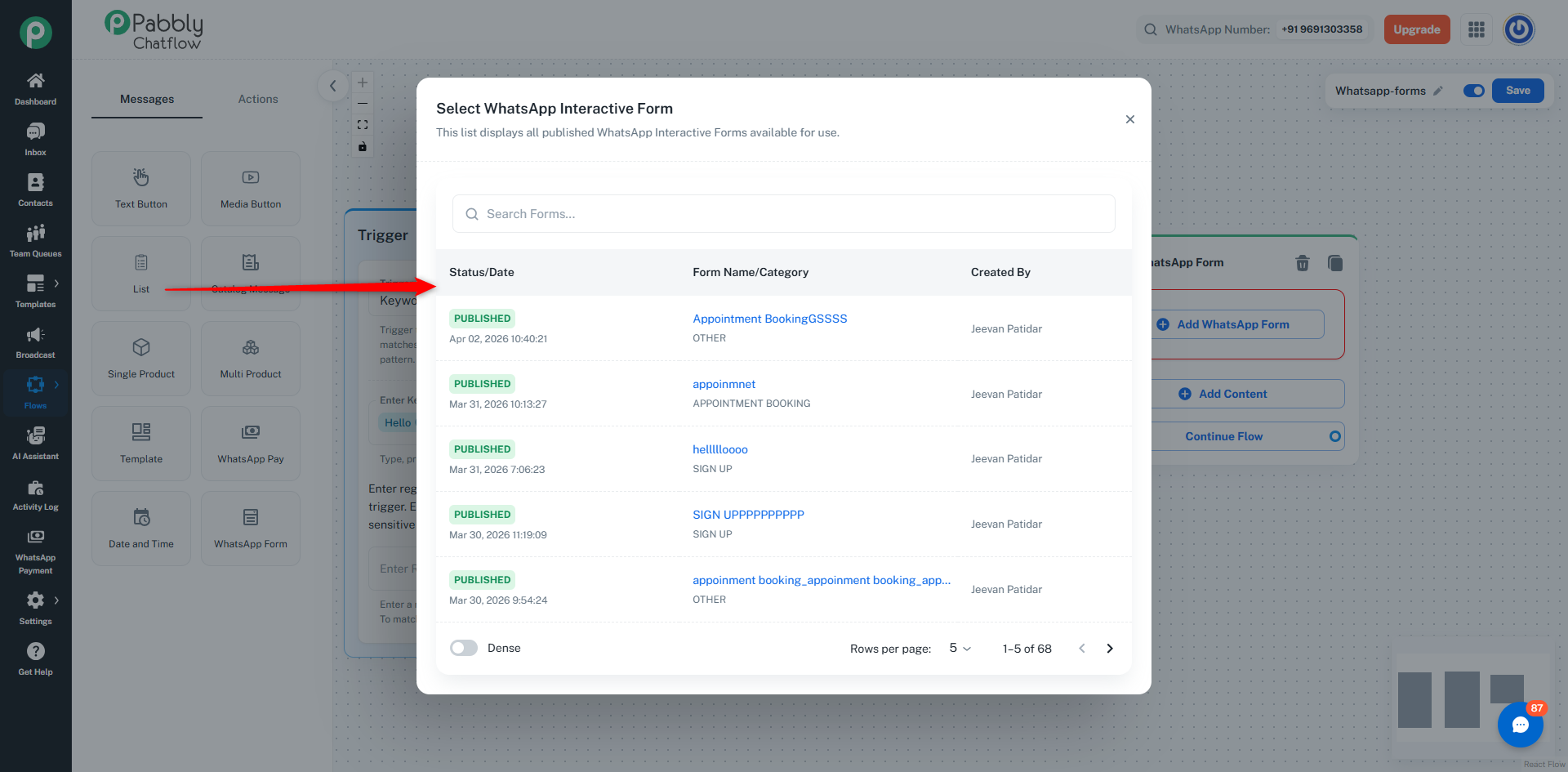
Step 1: Select Form
- Choose from published forms only
- Search and select your form
Step 2: Configure Message
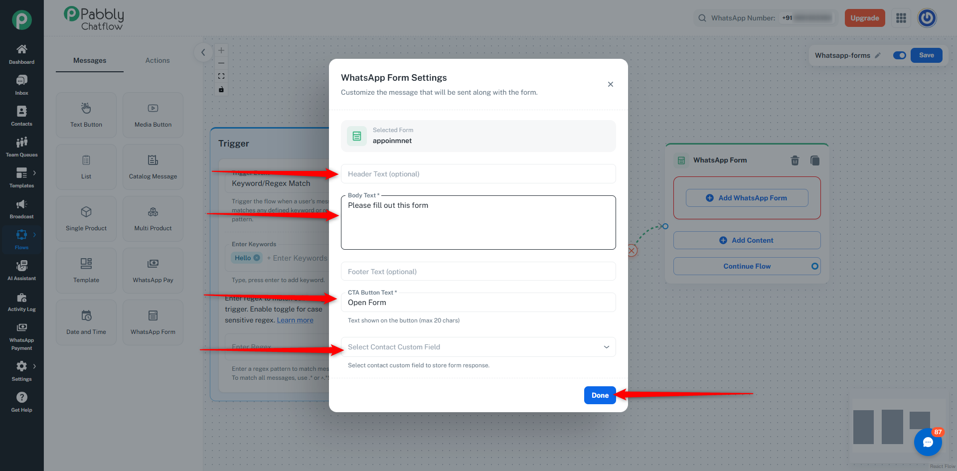
Add details:
- Body Text → Message shown to user
- CTA Button Text → Button label (e.g., “Open Form”)
- Header/Footer (optional)
- Contact Custom Field (optional) → Store response data
How It Works
- User triggers the flow
- Form is sent automatically
- User fills the form
- Response is captured
👉 Responses appear inside the Inbox chat
👉 You can also store responses in contact fields
💡 Use Cases
1. Lead Collection
- Trigger: User sends message
- Action: Send lead form
- Result: Capture user details automatically
2. Appointment Booking
- Trigger: User types “book”
- Action: Send booking form
- Result: Collect date, time, and details
3. Customer Feedback
- Trigger: After support interaction
- Action: Send feedback form
- Result: Collect ratings and feedback
4. Order Placement
- Trigger: User wants to buy
- Action: Send order form
- Result: Collect order details and address
 Pabbly Chatflow Team•Updated Oct 24, 2026•7 min read